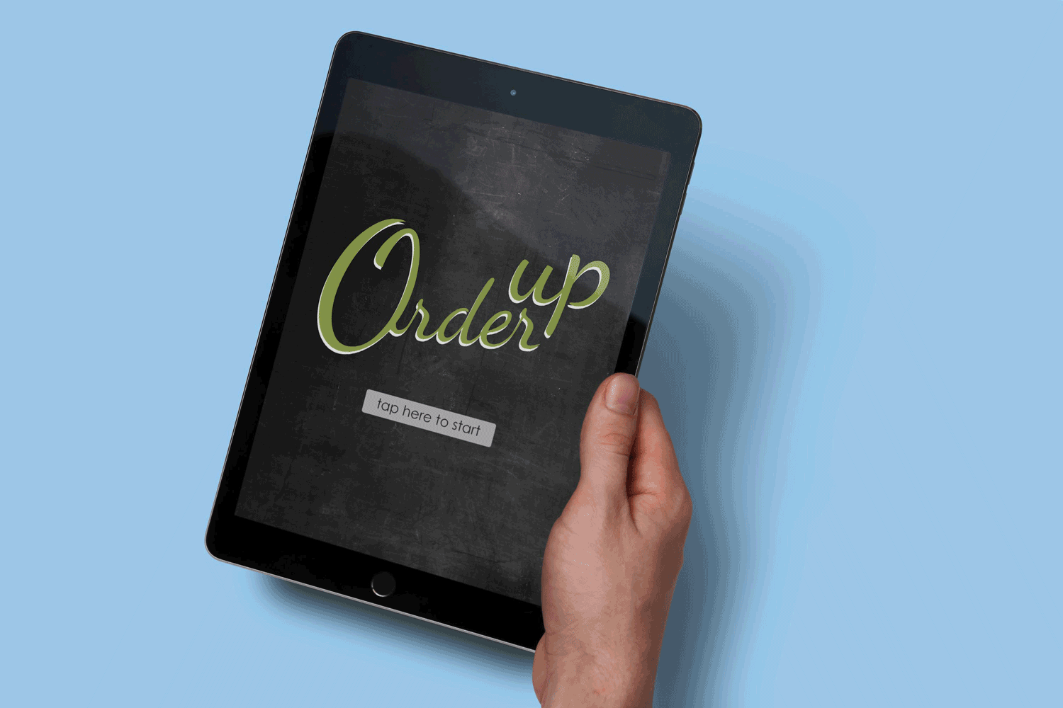

What Is Order Up
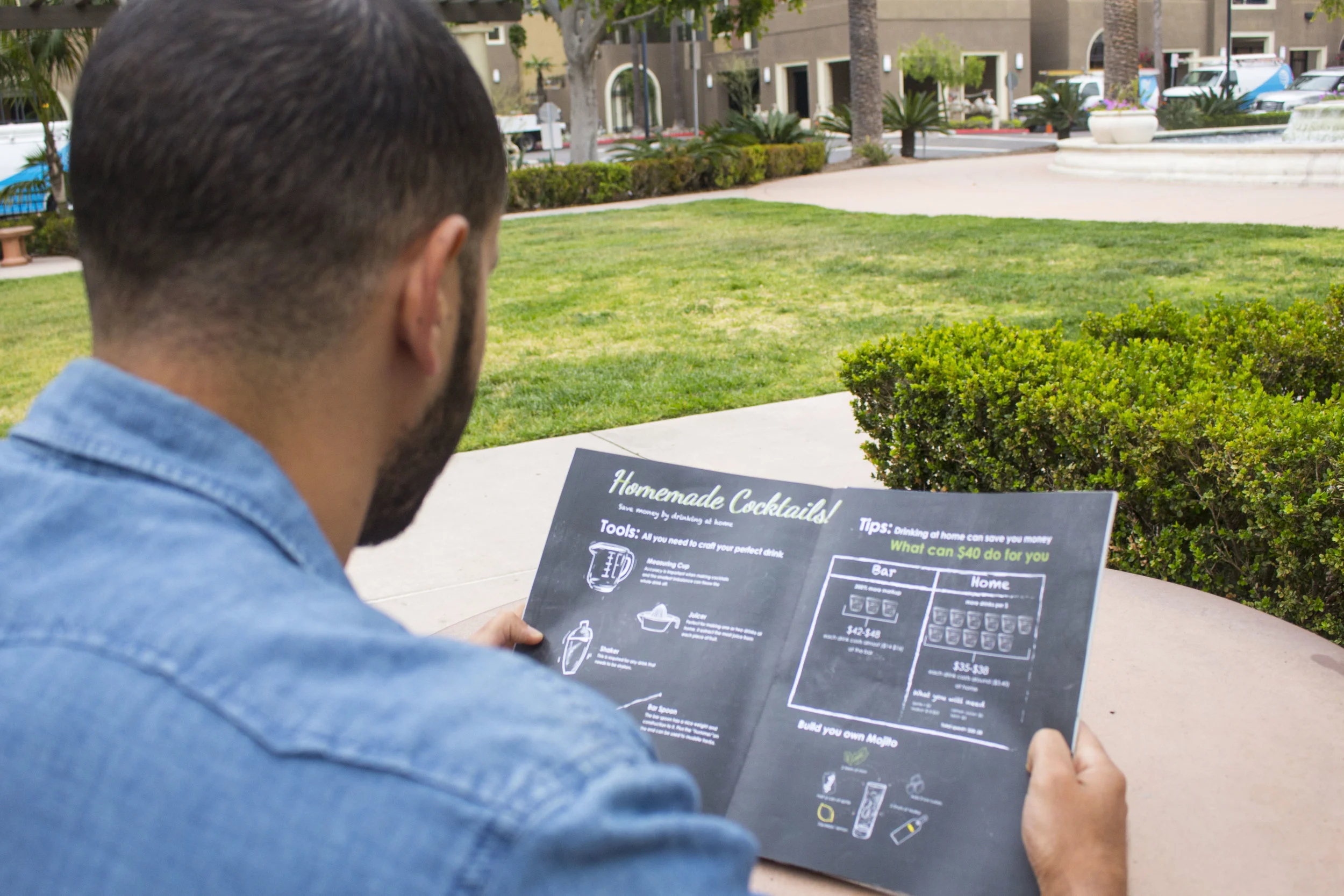
This was an infographic project. The goal of the class was to individually research an unfamiliar topic we were interested to learn more about, and based on this research, we were asked to deliver a poster, magazine spreads, and an app. The topic I decided to research was Vodka. The objectives were: to learn how to order a drink, understand how alcohol is made, and tips to save money when drinking. Ultimately, the goal was to create a visual learning experience for the user.
Target Audience
Testers, age: 21+, People who occasionally drink and enjoy experimenting with new flavors.
Savers, age: 21-26, College students on a budget who cannot always afford to drink out.
Home drinkers, age: 26-80, Easy going people who enjoy a good drink during the weekends in the comfort of their homes.
Brand Role
Project Manager, Illustrator, Designer, Researcher
Attributes
Fun, Creative, Entertaining, Attractive, Clear
Category
Infographic
Year
Spring 2017
Research
MoodBoard

Survey


Audience Need
How to make delicious drinks on a budget
Teaching beginners how to order a drink
Learn about tools used to create different cocktails
Money management when it comes to drinking
Process
Wireframe


Project Challange
Figuring out a way to make the black board effect realistic
Translating heavy textual content into simple infographics
Organizing the flow of the information, and how the eye goes from one place to another within the space.
Creating a simple, beneficial app that teaches people how to create a drink and how to save money
Project Solution
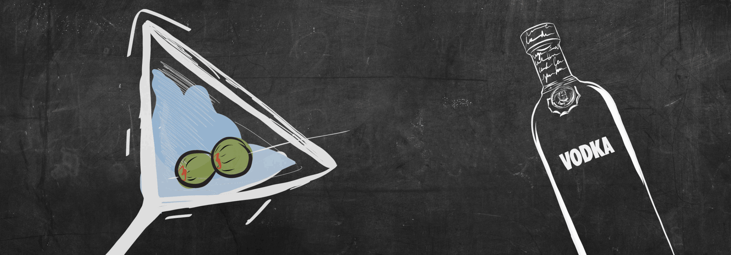
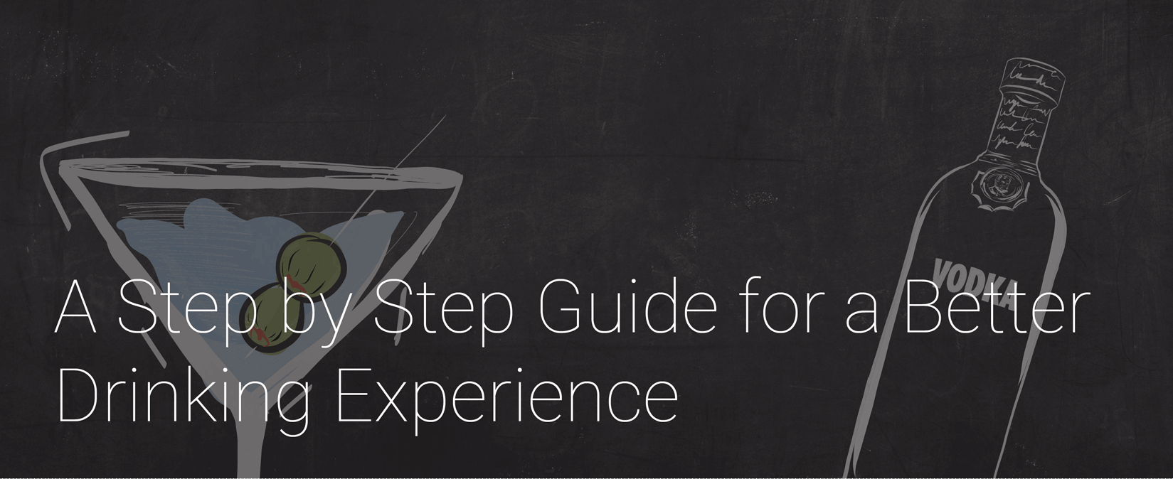
To give the project a blackboard effect, I added a black board image and chose a hand-rendered font that looked as if I was writing on a blackboard
Translating the text into a simplified infographic took many trials and errors, I made many revisions and surveys to mak sure the appropriate information was being illustrated
I created a focal point in each magazine page, then distributed the information based on the focal point.
The app was very straightforward, it was divided into two sections to make it as accessible and clear as possible.
Magazine Gallery